A leading australian health and beauty retailer wanted a holistic view of their customers in order to identify the service experiences that have the most impact on customer perceptions and experiences. This customer research highlighted key purchase behaviours and identified digital and non-digital opportunities that will help improve customer satisfaction and experience.
Through a customer focused behavioural research we get the ability to focus on a single design challenge: how might we help customers to save time in store and give them a more personalised experience?
This project has been lead by the UX researcher Kelly L. (Melbourne, Australia).
What we did:
- Align: customer definition workshop to define customer segments to be interviewed and to discuss current knowledge and assumptions about the customer journey.
- Immerse: 79 store intercepts (2-5 minutes) focused on brick-and-mortar store and mobile app experiences; 8 contextual inquiries (90 minutes) at participants’ homes.
- Create: an indoor location mobile app concept (high fidelity screens design and Marvell app prototype).
- Prove: 2 prototype iterations tested with 8 participants.
- Deliver: updated visual design, assets, testing reports.
Store intercepts
Interviews consisted of a 9 question short-answer survey which took participants approximately 2-5 minutes to answer. We asked customers to talk about:
- The reasons behind their store visit and purchase decisions.
- The use of mobile in store.
- Their feedback on a potential app, where they identified general features that might benefit them.
- Their thoughts about an interactive map feature in the app.
- Their current digital interaction with this health and beauty retailer technology in general (including their usage of other online retailer apps).
Key insight:
- Say/do gap with customer intentions toward the interactive map application.
- Many customers (53%) liked the idea of the map and said that they would use it, yet, when asked whether they had used their mobile during their store visit, not even half of them (40%) had looked at, or used their phone in store.
Contextual inquiries
These interviews happened in the home of each customer. We asked participants to talk about:
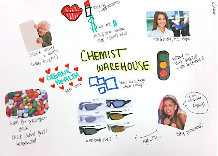
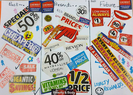
- Their experience with the brand –past, present and future.
- Their ideal shopping experience (for health and beauty goods).
- Their experience with online shopping –the good and the bad.
- Review features that exist within the current digital landscape.
- Their future digital expectations of this retailer.
Key findings:
- Price is a significant motivator for customers to purchase products from this retailer rather than others.
- Convenience is also a requirement, if it drops this becomes a major pain point for them.
- Customers associate the retailer with having more variety/availability than competitors.
- Customers are seeking for advices to make an informed choice, especially when it’s about health products.
Participant homework
Participant homework
App mockup user testing
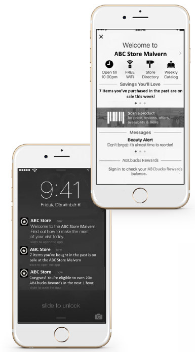
We presented an array of potential features that could be feasible. The features were shown on printed out mock screens to verbally gather feedback and also have them annotated with information about what they particularly liked and disliked.
Features mockup
Features mockup
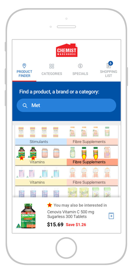
High fidelity screens design
Finally we designed a high fidelity prototype based on mockups feedback in order to do two sessions of user testing in our lab and refine the features.

