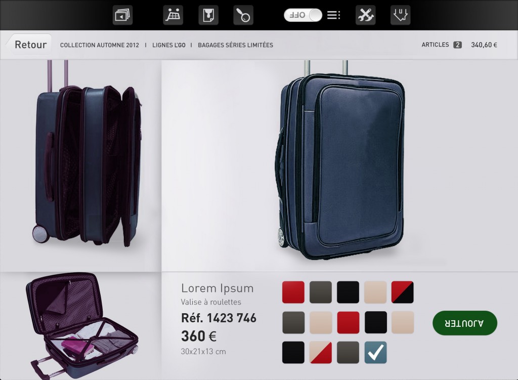
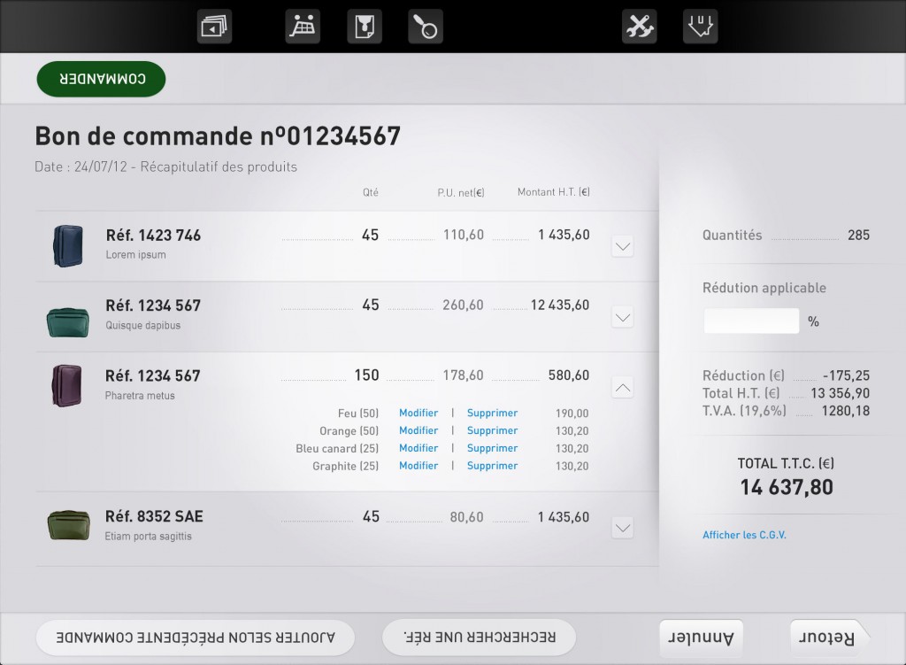
This B2B application concept has been originally designed when I was working for Clever Age and was presented for a competition pitch.
When sellers have to show and sell products to their retailers with a tablet application, they can be in front of their client or side-by-side, moreover the tablet could be use on a stand and remote controlled. These different positions require a seamless adaptation of the content to keep everything perfectly easy to read and interact with.
The seller should not move all the time the tablet or try to figure what’s happening on the screen when its retailer want to focus on the product at the same time.
The Idea
I imagined a tablet application concept which allow sellers to manage clients, meetings and orders for each steps of their working day. I started my research with some in store guerilla interviews to understand the different difficulties that would occur.
Before the client meeting
The seller needs to prepare the appointment by learning from past orders and sales. The application helps by delivering the last analytic and it’s able to predict the product categories and options with a better sales rate. Seller and retailer could decide to follow the predictions or choose by themselves.
During the appointment
It’s a real-time situation with two people (at least) watching the same screen. I focused on the readability of product information and call-to-action by thinking about body positions (face-to-face, side-by-side…) and the tablet standing (on a desk, in hands). At last, Seller’s actions have to be clear but call-to-action need to be inconspicuous.
After the sale
After the meeting, the seller has to be aware of any changes made by the retailer or by the factory. By connecting the application to the seller’s mobile phone, notifications and alerts could be send and keep everyone updated.
The concept
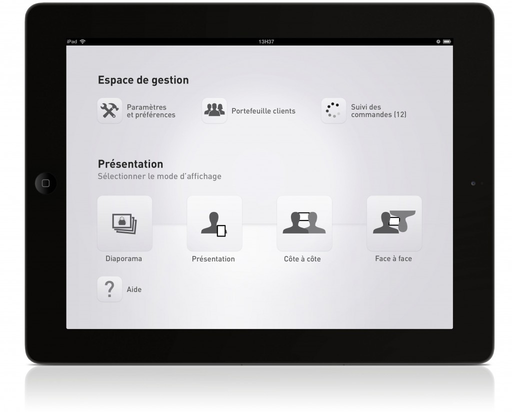
Three presentation modes
Depending of the seller situation:
- side-by-side,
- in-front-of
- or single user.
Each choice impact the way to show products, information and call-to-action. The price, options and product information are displayed for the retailer, but call-to-action are for the seller.
Rich gesture navigation
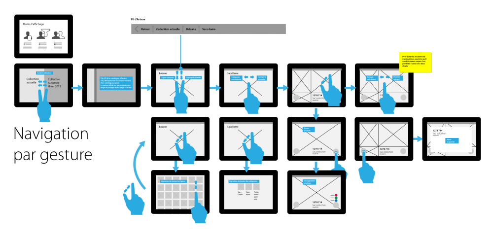
Advanced users are able to access to the content with an advanced touch navigation system using gesture to maintain a fluent conversation. I decided to limit the possibilities to a single-hand and three fingers combinations maximum to keep user away from memorizing difficulties. An alternative standard navigation is also available.
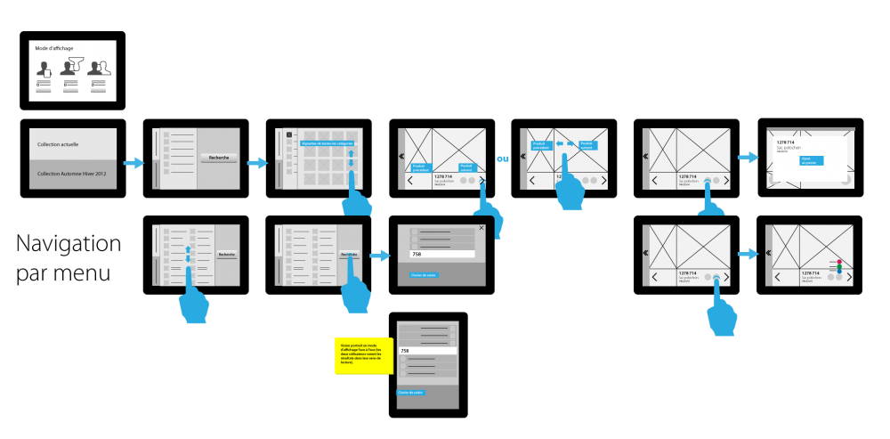
In store app concept, classic navigation
In store app concept, gesture navigation
The seller has to know their product catalog and products but I choose to help them to remind some important information about products (because some sellers are beginners or part time workers). In an advanced mode, product information could be hidden to display only the essential and put forward the product picture.
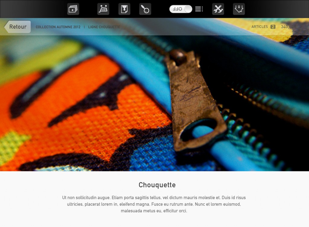
Hi-fi wireframes
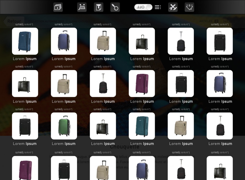
Hi-fi wireframes
To go further
I imagined to use the camera to do a face recognition (seller ID and position in space) that setup automatically the right fit configuration.

