Problem to solve
The website new design project was a part of a global digital transformation. The complexity of Invacare’s products make customers feel confused with the right fit product choice. I identified that when the complexity become a pain, customers are more inclined to follow the recommendations of a trusted adviser like their medical practitioners.
The main problem for Invacare, from their customers perspective, was to give them the opportunity to make a choice with a better knowledge of the facts.
Invacare is a french company that acquired other competitors in Europe to become Invacare International, the European leader firm for healthcare material. Each main European regions has been let quite free to manage their own business and marketing. When Invacare called Clever Age to help them with their digital transformation, we identified that we needed to engage the stakeholders in a shared vision and in a more collaborative process.
Stakeholders management
Exploration workshop
Exploration workshop
It was a requirement to learn from each regional marketing managers their context and constraints. I started by interviewing them individually over the phone, introducing them with the customer experience process and my plan to engage them.
As a huge gap appeared between regions, it was clear that I needed to bring them all into a same place and make them talk together. A 3 days workshop has been organized with the aim of build a shared vision for the new design website.
During these 3 days:
- we started with the learning from the phone interview and the identified gaps;
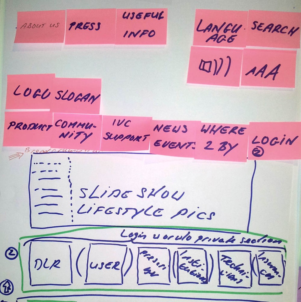
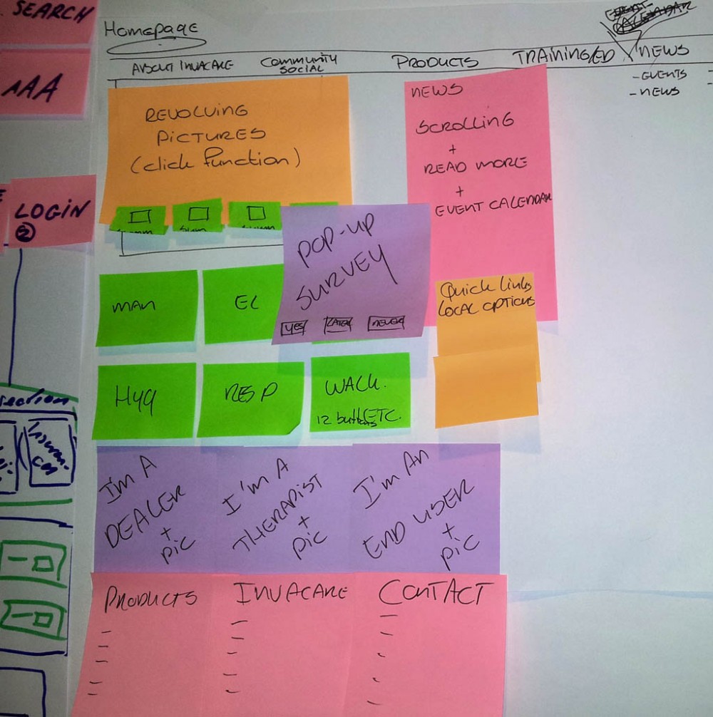
- we sketched a few web pages;
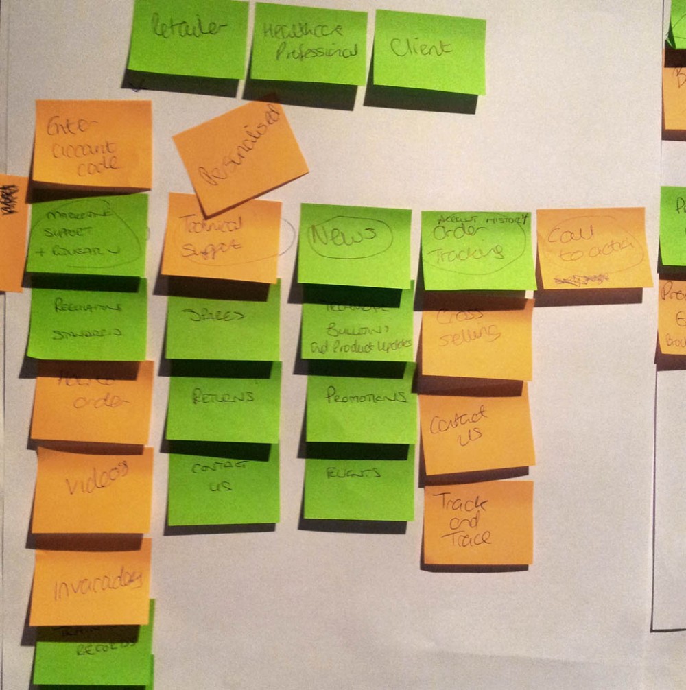
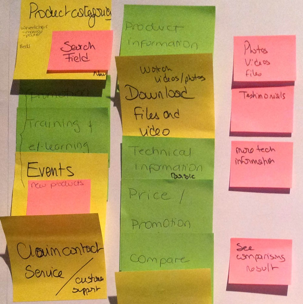
- we identified their vision for the IA through a card sorting session;
- we brainstormed about the purpose of the new visual design.
At this point I would have had my current understanding of the Design Thinking process to make the workshop seamless and more efficient, and bring them further that what I did. But we also achieve what I expected, the managers were now engaged and more inclined to collaborate together.
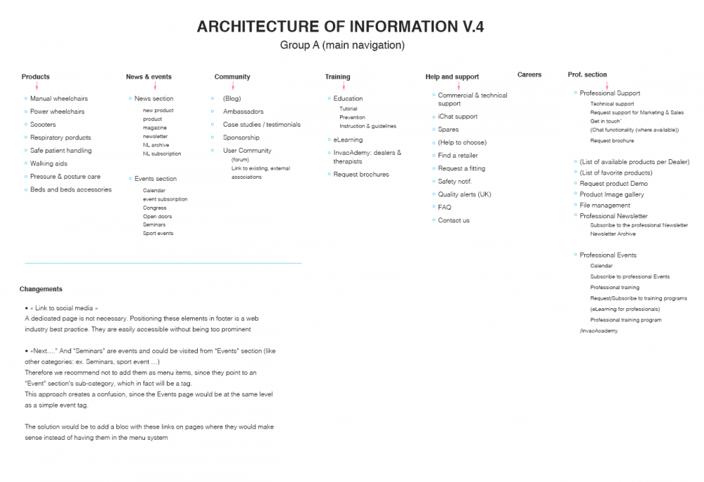
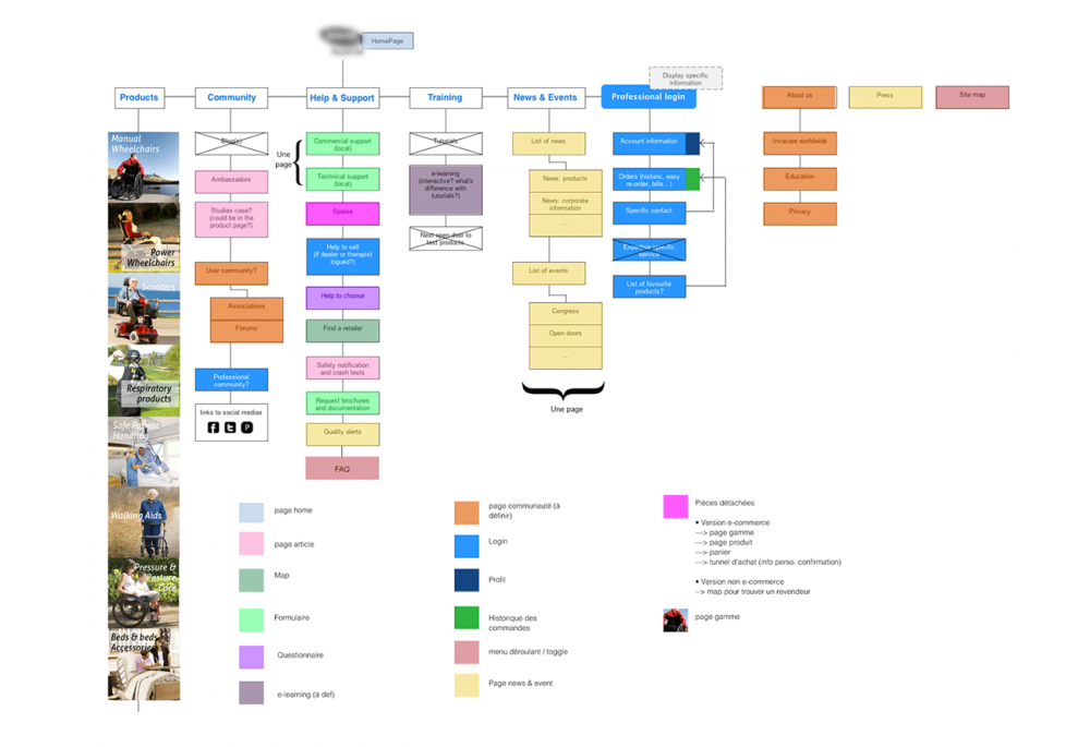
Information architecture
Information architecture meeting content typology
Marketing manager sketches for the new home and product pages
Marketing manager sketches for the new home and product pages
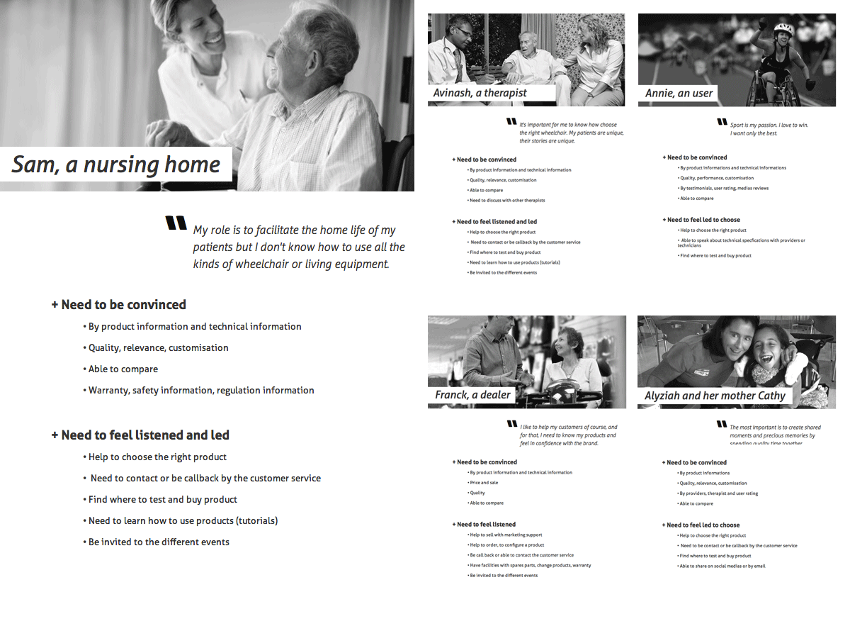
A few macro-personas based on the customers data provided by the marketing managers.
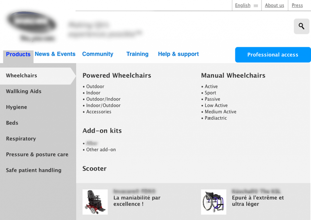
Navigation menu
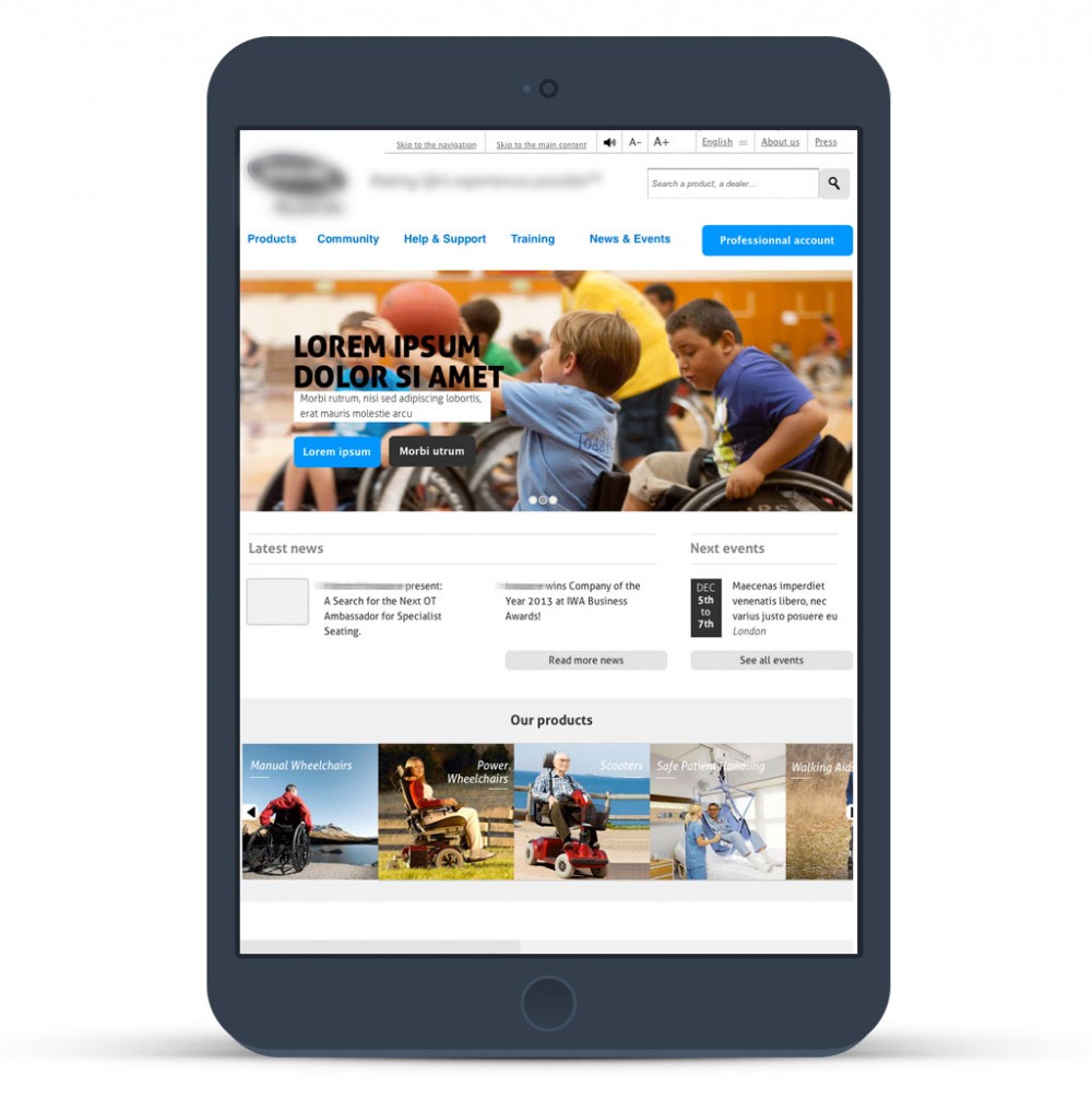
Home page on tablet (Responsive Web Design)
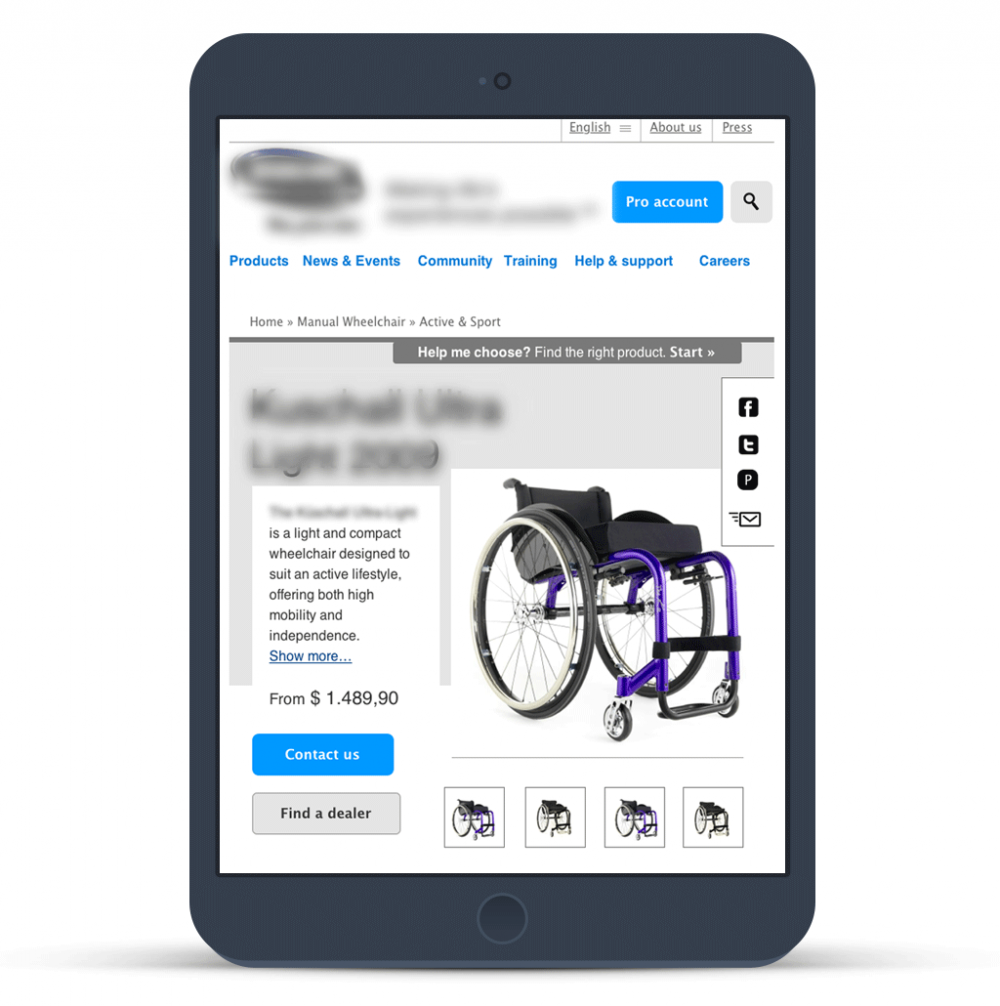
Product page on tablet (Responsive Web Design)
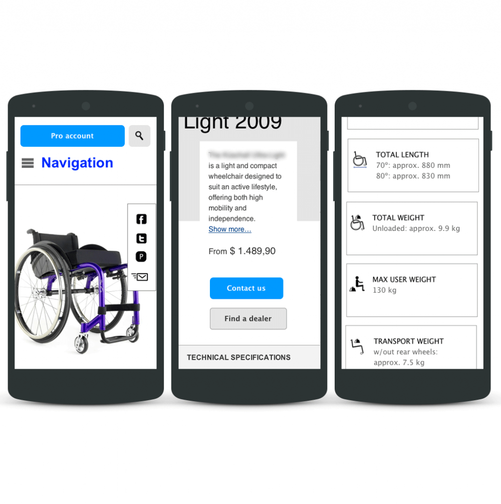
Product page on mobile (Responsive Web Design)
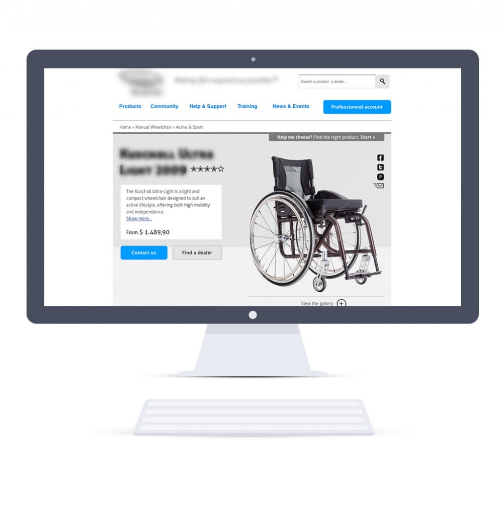
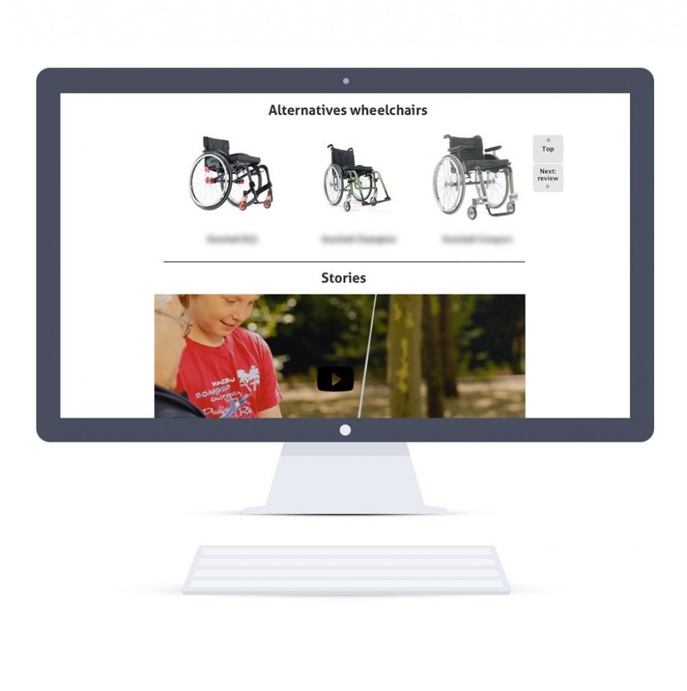
Home page on desktop (Responsive Web Design) – top page part
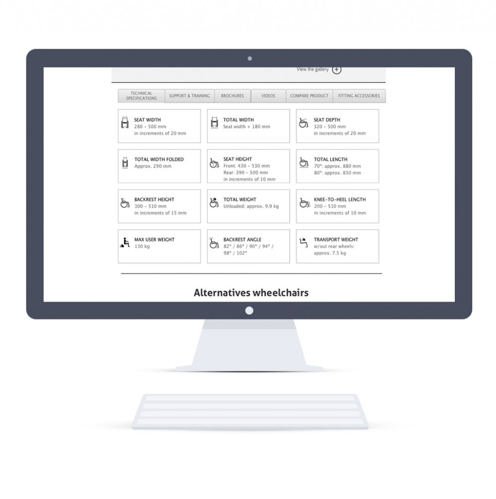
Home page on desktop (Responsive Web Design) – technical information part
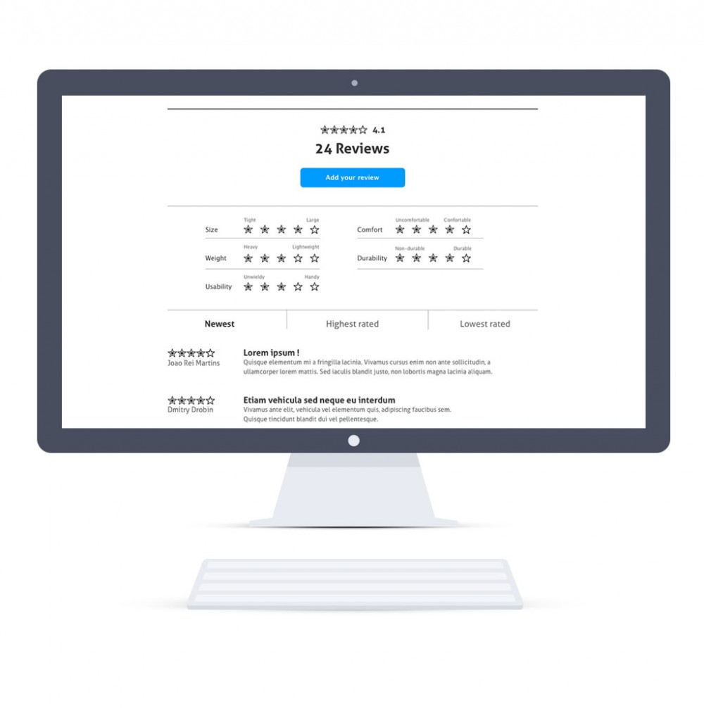
Home page on desktop (Responsive Web Design) – user reviews part
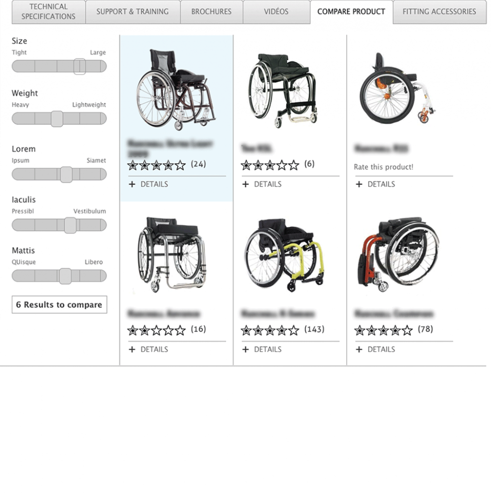
Product comparison feature

