This project has been done when I was working for Clever Age.
Problem, opportunities and fail
Paper made standard business cards could be lost, easily damaged, quickly out-of-date. When your daily job is about building professional relationship, collecting more and more cards is a painful process as you also know that most of the collected information is going to be useless by a few months.
There was an opportunity for Popwings to become the first smart business card using a contact-less technology and keeping all the data up-to-date in the cloud. To achieve this goal Popwings team (Gemalto technologies) and I decided to associate a physical card and a mobile app to manage the contacts book.
Unfortunately after a few years, the startup failed to become viable. The main identified reason could be the lack of NFC support by Apple products. It could also be due to the difficulties to create a new habit, especially when it’s all about traditional culture.
Popwings team was trying to create and manage partnership with banks and universities (Santander Universidad Chile, student card is also a bank and a business card) or during high tech events (Microsoft TechDays, event pass is also a business card).
Process, startup and agile
The project has been done in a close and multi-disciplinarity team, partially remotely. Popwing is an initiative made by Gemalto technologies employees and integrated into its incubator. We worked in Agile with short cycles of design iterations and user testing. I have been involved into the team for 15 days.
If I had know the Design Sprint process at this time I would have definitively used it as it appears now that it would have fit perfectly: close team, short period of time to deliver final design, needed to iterate quickly to confirm or invalidate assumptions.
But I didn’t know that process when I join the project, even if my plan lead by the short timeline appears quite similar to the Google Venture methodology.
The first couple of days were dedicated to the understanding of the context by testing the previous version of the app with final users (no previous research has been done before, it was the opportunity to learn from user and identify the pain points of the service).
Then each week was introduced by a scope definition and a sketching workshop. We were able to design quickly a few new screens or new iterations, wrap them into a prototype and test it with users by the end of the week.
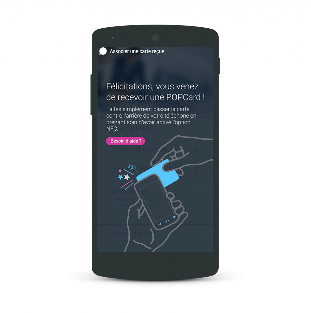
Card association – popwing app
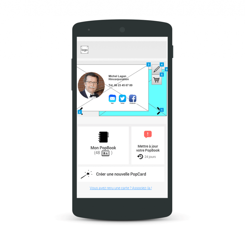
Home screen – popwing app
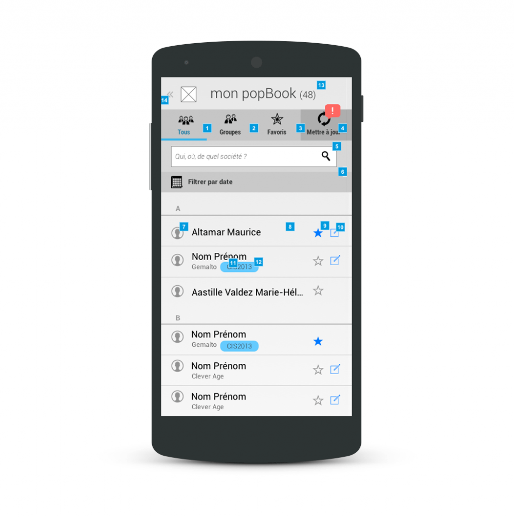
Contact list – popwing app
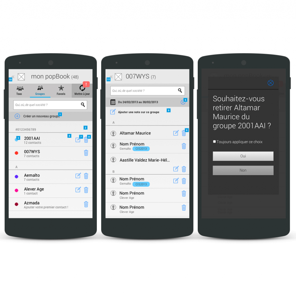
Group list – popwing app
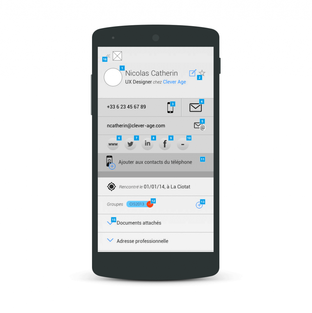
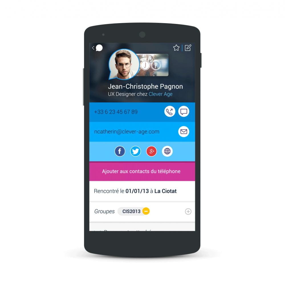
contact information – popwing app
Contact information – popwing app
Quick win features
Helped by the first testing session, which was also the opportunity to interview users about their perception of the service, I and the team decided to focus on the following features:
- a quick tour to onboard user into the application and the NFC technology;
- a better contact book with some new filters and an easier way to recall someone you met (not only based on who, but also when and where);
- an easy way to synchronize the contact book data with social media (to keep the contact details always up-to-date);
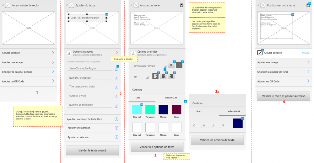
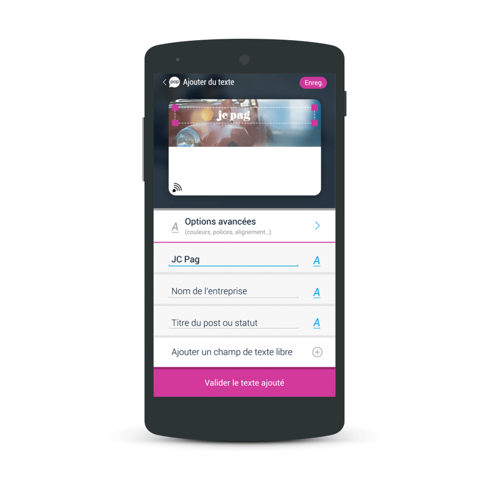
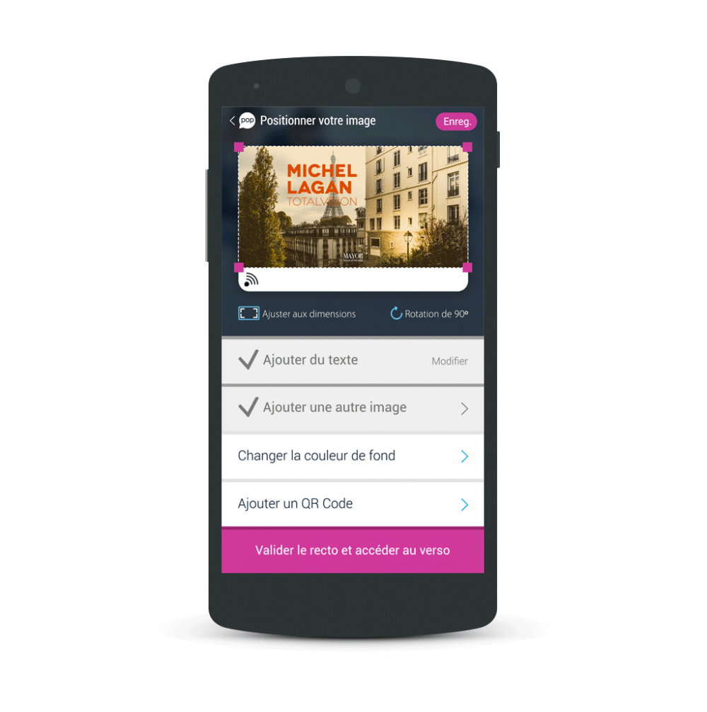
- an in-app card customization tool to create your own NFC card.
Customization process – powping app
Customization process – popwing app
Popwings is a 4.4 scored on the Google Play Store. The development of the startup has been stopped in november 2014.
I made the visual design in collaboration with Sophie Taboni. The development of the application has been done by Metsia.

